What’s new
August 2019
@carbon/cli@10.5.0
New features
- feat(cli): add changelog command #3890
carbon-components@10.6.0
New features
- feat(inline-loading): introduce error state #3772
- feat(ui-shell): add option for large variation and disabling mouse listeners #3802
Bug fixes
- fix(css-reset): apply box-sizing reset to all descendants #3884
- fix(toggle): use rem instead of px values #3858
- fix(grid): update margin at max breakpoint #3824
- fix(checkbox): reverse label text #3845
- fix(TableToolbarSearch): support back-tab #3836
- fix(tabs): update token values #3828
- fix(fileUploader): add in disabled styles #3799
- fix(tile): a11y fixes for expandable tile #3785
- fix(content-switcher): set height in button container instead of button #3758
- fix(breadcrumb): terminating slash based on current page existence #3750
- fix(type): add default type feature flag #3742
Housekeeping
- chore(release): update package versions #3863
- refactor(modal): remove leftover mixin #3846
- chore(devenv): simpler custom properties build #3851
- chore(release): update package versions #3826
- chore(readme): remove references to Bluemix Components #3818
- refactor(tooltip): avoid calc inside
transformfor IE support #3739 - chore(date-picker): fix date picker disabled state colors #3761
@carbon/elements@10.6.0
Bug fixes
Housekeeping
@carbon/grid@10.6.0
Housekeeping
- chore(release): update package versions #3863
@carbon/icons-handlebars@10.6.0
Housekeeping
- chore(release): update package versions #3863
@carbon/icons-react@10.6.0
New features
- feat(icon-build-helpers): add icon-build-helpers #3820
Housekeeping
- chore(release): update package versions #3863
@carbon/icons-vue@10.6.0
Housekeeping
- chore(release): update package versions #3863
- chore(release): update package versions #3826
- refactor(icons-vue): port icons-react changes, refactors, optimizations #3643
@carbon/icons@10.6.0
New features
Bug fixes
- fix(icons): update ci-check and fix metadata #3856
- fix(icons): remove fog.svg #3878)
- fix: 3D-iCA metadata #3709
Housekeeping
- chore(release): update package versions #3863
@carbon/layout@10.5.0
Bug fixes
- fix(grid): update margin at max breakpoint #3824
Housekeeping
- chore(release): update package versions #3863
carbon-components-react@7.6.0
New features
- feat(TooltipDefinition): port vanilla WCAG 2.1 fixes #3840
- feat(inline-loading): introduce error state #3772
- feat(Tooltip): support controlled and uncontrolled modes #3357
- feat(ui-shell): add option for large variation and disabling mouse listeners #3802
Bug fixes
- fix(Slider): remove redundant labelText #3894
- fix(Dropdown, ComboBox): adds listener to open/close menu on enter #3862
- fix(TableToolbarSearch): support back-tab #3836
- fix(fileUploader): add in disabled styles #3799
- fix(sidenav): sidenavmenu stays open when in rail #3626
- fix(tile): a11y fixes for expandable tile #3785
- fix(breadcrumb): terminating slash based on current page existence #3750
Documentation
- docs(Icon): more detailed migration guide #3789
- docs(data-table): update readme code block lang to jsx #3779
Housekeeping
- chore(release): update package versions #3863
- chore(Tooltip): cleanup and remove outdated
clickToOpentests #3866 - refactor(TableToolbarSearch): remove unused classname #3839
- chore(toolbar): add proper aria labels #3844
- chore(release): update package versions #3826
- chore(storybook): update brand url to new monorepo pkg #3784
@carbon/themes@10.6.0
Housekeeping
- chore(release): update package versions #3863
@carbon/type@10.5.0
Bug fixes
- fix(type): add default type feature flag #3742
Housekeeping
Archive
- July 2019
- March 2019: v10 release
- February 2019
- October 2018
- June 2018: v9 release
- May 2018
- March 2018
- February 2018
- January 2018
Following the Carbon v10 release, we restructured our repos and much of the Carbon site. Older links may not work.
July 2019
Our release focused on the following projects:
- Community contribution
- Icons
- Patterns curriculum
- IDL site QA and release
- Website content and strategy
- Design kit
View our v10.4.0 changelog for more details.
March 2019: v10 release
Carbon v10 is released. The Carbon Design System adopts the new IBM Design Language.
- There are extensive visual changes, and some functional changes, to all components.
- There should be feature parity with Carbon v9.
- For full information on component changes, please refer to the migration guides; Carbon Components Vanilla Javascript, Carbon Components React
- Introduction of production ready Carbon Elements package.
- The Carbon Design System website at next.carbondesignsystem.com will convert to the www site on 4/1/2019.
February 2019
The Carbon v10 launch is just around the corner, and we’ve officially entered Beta! That means the core team has been hard at work ensuring the new system is ready to ship. We have tons of improvements headed your way, including implementation of the new IBM Design Language and an all-new website.
We expect v10 to launch mid-March, so keep your eyes peeled. If you’re interested in getting started before our public launch, we’re always looking for beta testers to help us squash bugs and improve the Carbon Design System.
October 2018
Experimental
A new Experimental section has been added to the website. Experimental components, designs, patterns, and other resources are work that is still under development.
Experimental components, designs, and other resources are presented for testing and feedback. They are not intended for production use.
June 2018: V9 Release
Website
- Add-ons section has been removed. There is an Add-ons page that now lives under the Getting Started section
- The contribution overview page has been moved from the Guidelines to the Getting Started section
- Data Visualization has moved from under the components section into its own section
Components
New
Updates (Visual & Interaction)
- Code snippets now have a new style and new interaction options. There is also a variation with line numbers available.
- Interactive Tooltip (formerly Tooltip) can now contain interactive elements and opens on click
- Updated all inputs so they meet the new WCAG 3:1 color ratio guidelines for defined objects
- Date & Time Picker
- Dropdown
- Number Input
- Search
- Select
- Slider
- Text Input
- Text Area
Color
Go check out the Swatches page to see the new color options and updates.
- Colors have been updated to make them more accessible— changing hex values and roles for some of the swatches
- The new, updated palette is available with Design Kit
- The changes include (bold indicates a new color token)
$ui-05 – #5A6872(passing 4.5:1, high contrast border, secondary icons)$ui-04 – #8897A2(passing 3:1, now used for emphasis borders)$ui-03 – #DFE3E6(not passing 3:1, now used for subtle borders)$support-01 – #E0182D(passing 4.5:1)$support-01 – #CDD1D4(not passing 4,5:1, used only for placeholder text)$field-01 – #F4F7FB(input field background on$ui-01)$field-02 – #FFFFFF(input field background on$ui-02)$inverse-02 – #272d33(passing 4,5:1)
There are four new hover tokens added to the Carbon palette. They can now be found on the Swatches page and are available in the Design Kit and palette plugin
$hover-primary – #30588c$hover-primary-text – #294c86$hover-row – #5596e6at 10% opacity$hover-secondary – #3d70b2$hover-danger – #bd1427
Icons
- Check out the Iconography page to see the new icon style
- All Icons are now
16x16px(24x24px is no longer being supported). - The
--glyphmodifier has been deprecated. Most of the glyph variations were replaced with a--solid modifier. Check out the icon migration docs to see the status of all the icons.
Design Kit
- Download the latest version of the Carbon Design Kit & Library
- Components on the Component page are now split up into five different artboards: Controls, Content, Navigation, Inputs, and Data Tables
- Library has been made more flexible and customizable
- Kit and library have been updated with the new colors, components, and icon styles.
May 2018
Utilities
There is a new section called Utilities which gives guidance on common pattern handlings. Unlike the component section, these guidelines offer usage guidance with minimal code documentation. To read more about each of these utilities see the sections below:
Themes
The Themes page has been moved to the Style section.
March 2018
Style
Systematic spacing
We have tokenized our spacing and now offer two systemized scales. The Spacing Scale defines space within a component while the Layout Scale is used to help position elements on a page. Check out the new Spacing section to learn more about these scales and read the rest of the spacing guidelines.
Design Kit
Sketch Libraries
We have recorded a Carbon Design Kit with Sketch Libraries Tutorial over on our YouTube channel. It goes over how to download the Carbon Sketch Kit, import a Sketch Library, as well as how to get and accept library updates/notifications. It also gives a brief overview of how the Library is organized and how to use the overrides panel and library symbols.
February 2018
Design Kit
Sketch Libraries
The Carbon Design Kit now includes Sketch Libraries, a better way to share and version symbols across Sketch files. Check out our Sketch Libraries wiki to get a quick tutorial on libraries.

Sketch libraries in the Carbon design kit.
Sketch Plugins
With the latest release of the Design Kit, we’ve included the Sketch Palettes plugin, which allows you to load in pre-saved palettes for Sketch. You can import Carbon’s four color palettes (Carbon default theme, Data Vis primary, Data Vis secondary, and Data Vis tertiary) into your working Sketch document. There’s also a variety of other plugins we recommend to help improve your workflow using Sketch.
Download the latest kit today! Carbon design kit.

Sketch palettes plugin.
Carbon Sessions
Interested in getting some 1:1 time with the Carbon team? Carbon Sessions is a chance for anyone using the Carbon Design System to ask questions and get feedback. Sessions happen very Wednesday morning (Central Standard Time). Time slots are around 10 minutes, but feel free to book more than one if you need additional time.
Sign up for a Carbon Sessions time slot if you’re interested in chatting further!
January 2018
Components
Dropdown
We’re excited to bring some added functionality that enhances our Dropdown component. Filtering, Multi-select, and Inline Dropdown are new additions to our basic Dropdown component.
Note: This component is currently only available in React.
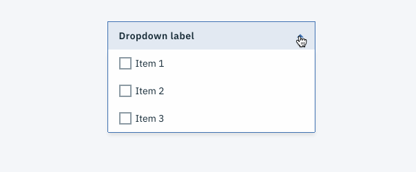
Example of a dropdown with multi-select.
Small Toggle
Small Toggle is a style variation of our traditional Toggle component. It’s more compact in size, which allows them to be used in Data Tables or inline with Form elements.
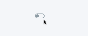
Example of small toggle.
Data Vis: Bar Graph
Bar Graph is the newest addition to our Data Visualization collection. It comes in two variations: Bar Graph and Grouped Bar Graph. You can use this component to represent quantitative information, such as comparing the taco sales between Austin taco shops in the month of June.

Data Vis: Tooltip
We have created several Data Visualization Tooltip variations to show the value for a specific data point or increment range. Tooltips appear on hover above or below a data representation, depending on the use case.
Read more about the usage of Data Vis Tooltips, or check out our CodePen to view the live demo.

Small tooltip used within a bar graph.